Client: Whānau Tahi
Project: Case management system UX/UI redesign & brand refresh
Focus: Clarity, accessibility, and culturally grounded care
Role: UX strategy, UI design, system usability & brand identity refresh
The Challenge
Whānau Tahi is a purpose-led healthcare platform supporting collaborative care across clinical and social service settings in New Zealand and Australia. Built on a culturally grounded philosophy of family and community well-being, the platform plays a critical role in how practitioners manage sensitive information and coordinate care.
The challenge was twofold:
- Improve the usability and clarity of a complex case management system used daily by practitioners
- Refresh the brand identity to better reflect Whānau Tahi’s values-driven mission—without compromising cultural integrity or trust
Objectives
-
Improve system usability
Make daily workflows clearer and more efficient for practitioners -
Enhance accessibility
Ensure the platform is easy to navigate across varied user roles -
Support collaborative care
Improve clarity across shared case information -
Modernise the brand
Evolve the visual identity while respecting cultural foundations
Research & Strategy
Edit Studio worked closely with the Whānau Tahi team to understand both functional and cultural requirements:
- How practitioners use the system in real-world care environments
- Where complexity and cognitive load slowed down workflows
- How the brand could evolve visually while remaining respectful and grounded
The strategy focused on reducing friction, improving clarity, and designing with empathy, ensuring the platform supports practitioners, not overwhelms them.
Design & Execution
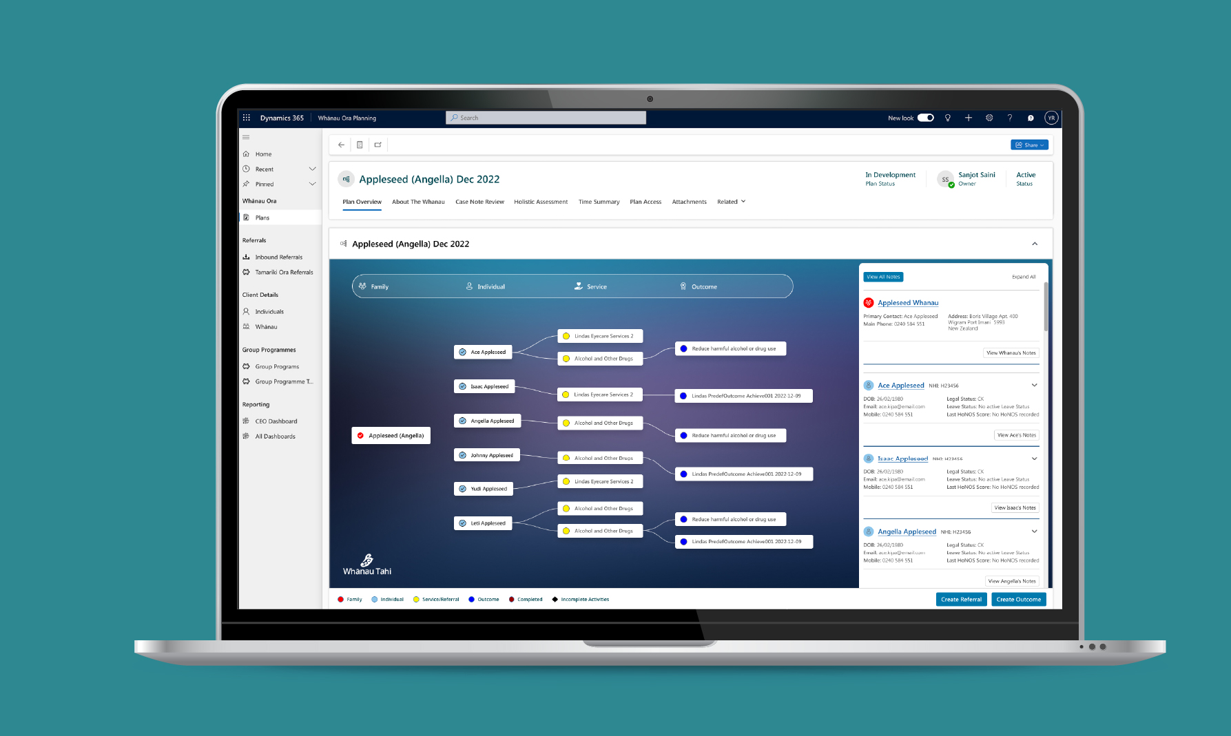
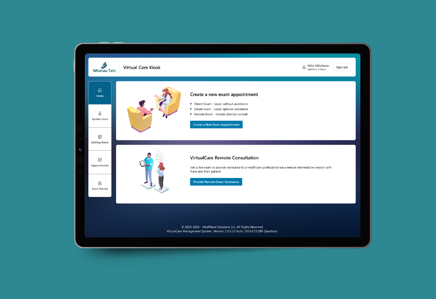
- UX Redesign of the Case Management System
Information architecture and user flows were refined to make case data easier to scan, understand, and act on, supporting faster, more confident decision-making. - Clear, Accessible UI Design
Layouts, typography, and visual hierarchy were improved to enhance readability and reduce cognitive load in a high-responsibility environment. - Practitioner-Centred Workflows
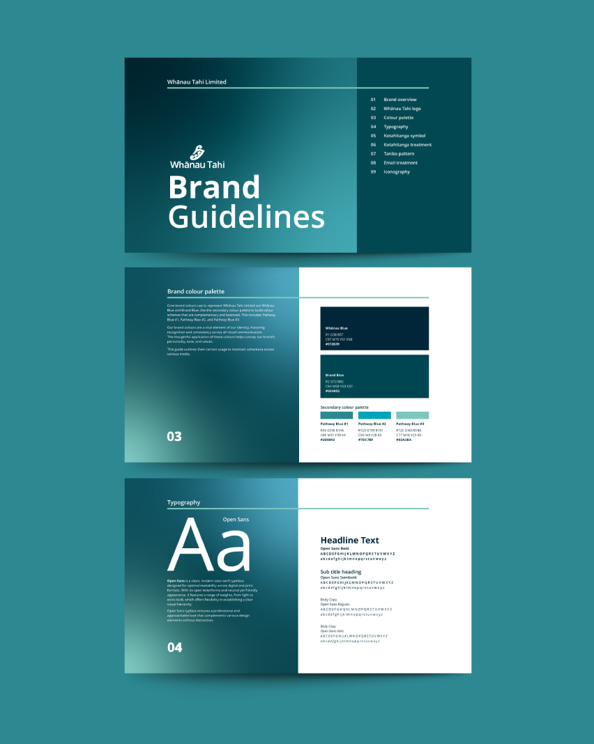
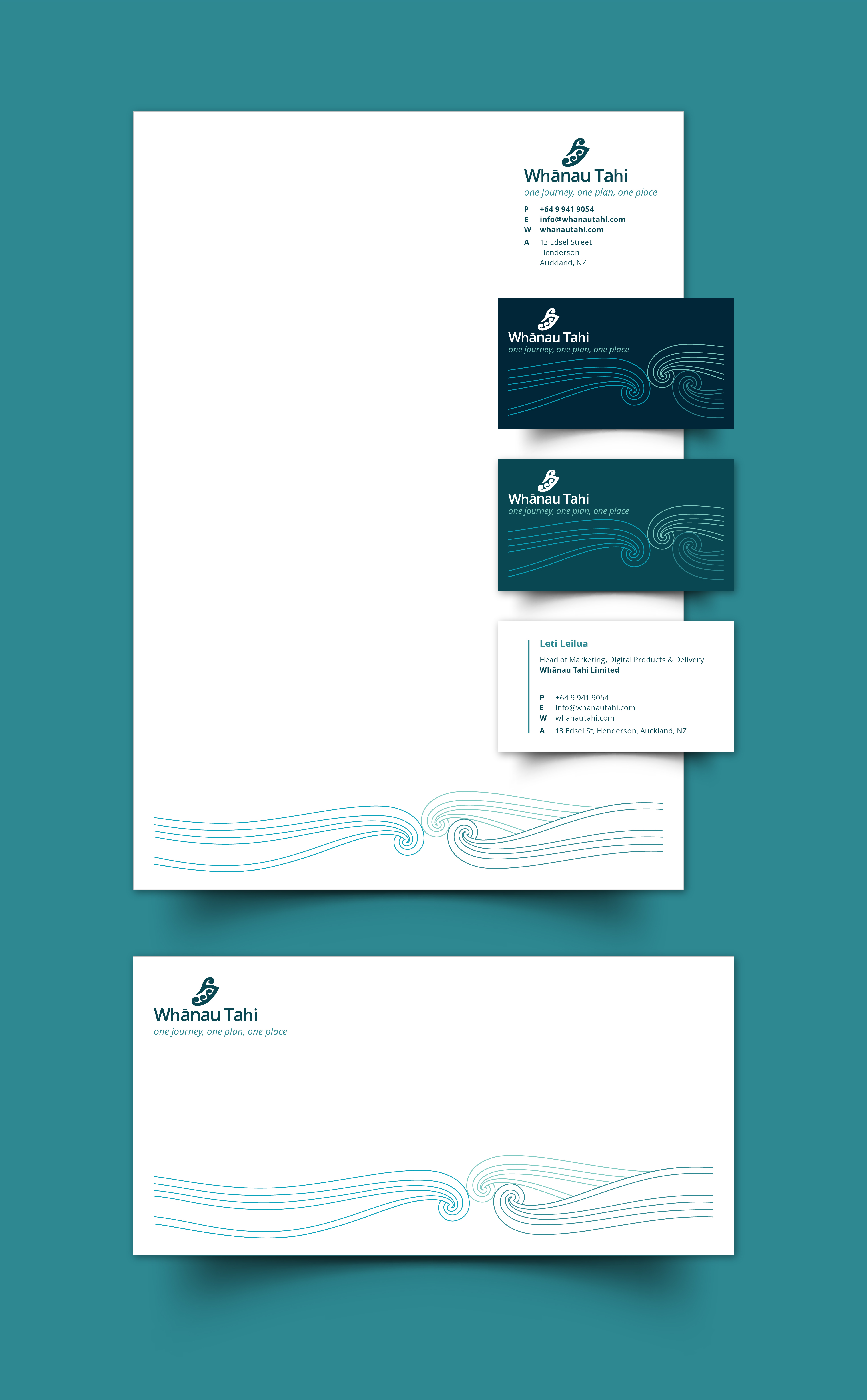
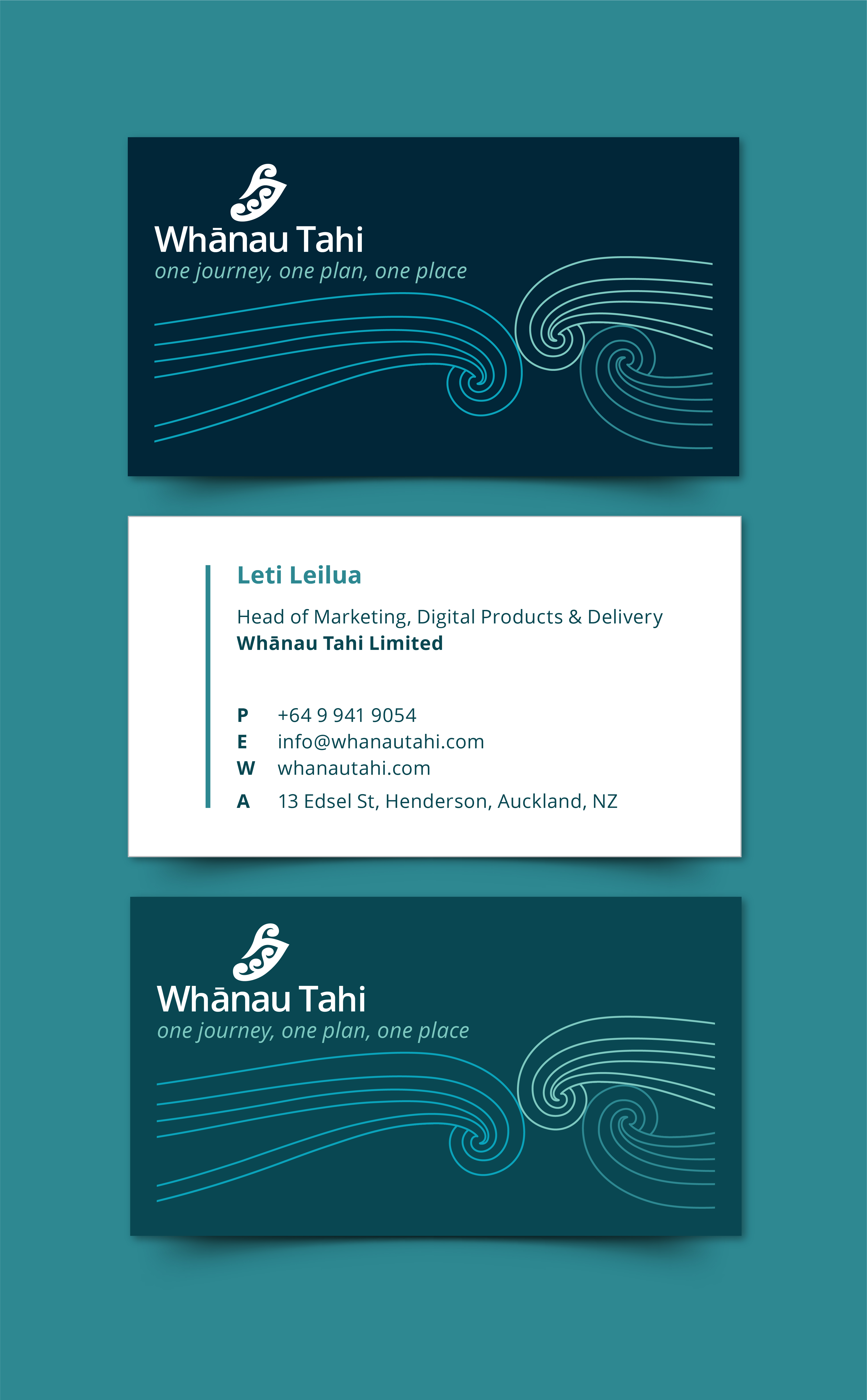
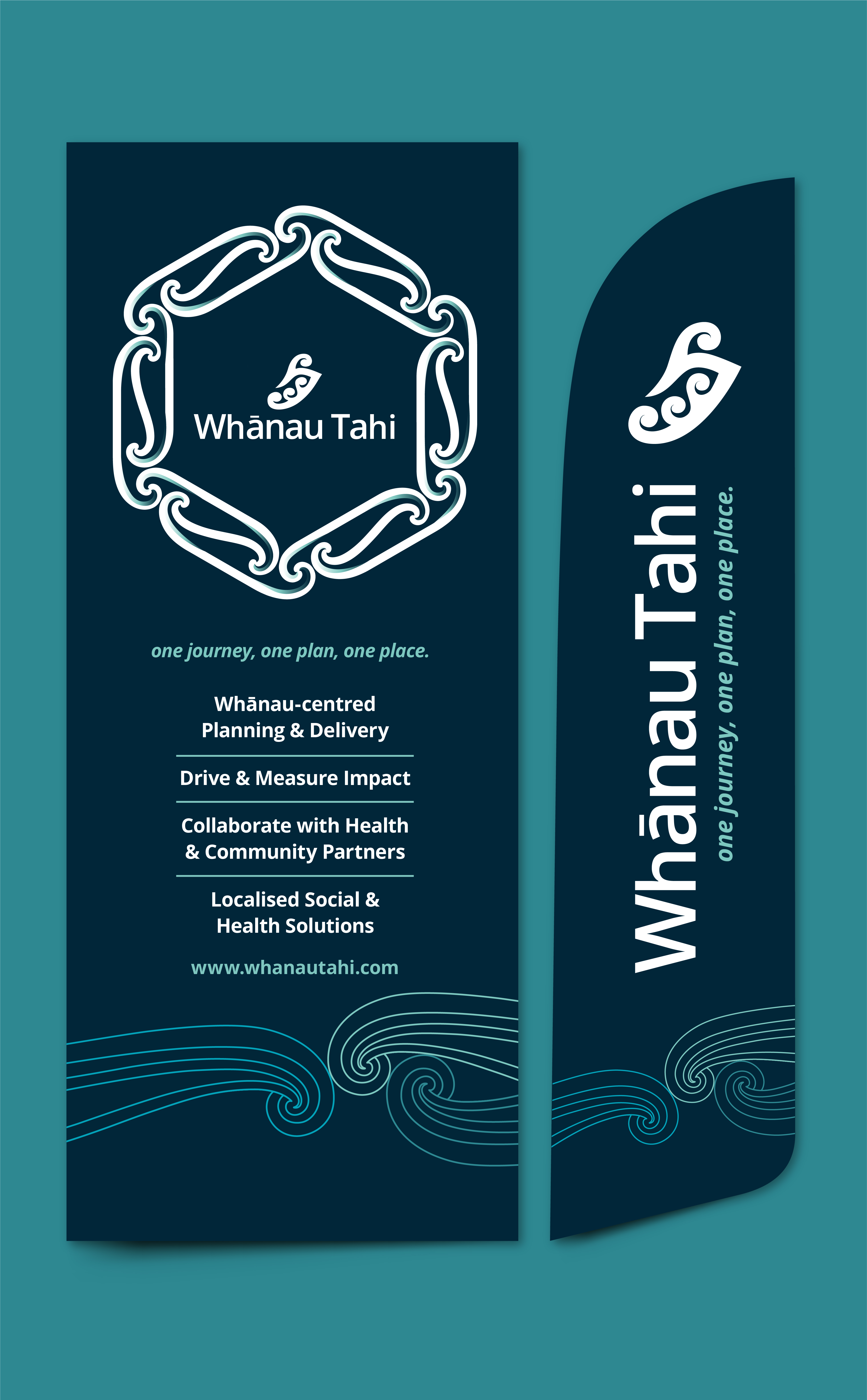
Design decisions were guided by the realities of collaborative care, ensuring the system supports communication across clinical and social service teams. - Brand Identity Refresh
Key visual elements were modernised to reflect Whānau Tahi’s progressive mission, while carefully preserving cultural meaning and trust.
Final Outcome
- A clearer, more usable case management experience for practitioners
- Improved accessibility and confidence in daily system use
- A refreshed brand identity aligned with Whānau Tahi’s purpose and values
The result is a platform that better supports collaborative care, balancing modern digital design with cultural respect and human-centred thinking.
People ignore design that ignores people